Track fewer numbers and act on all of them
For a service business, six KPIs carry almost all the weight: utilization rate, effective hourly rate, project margin, days sales outstanding, pipeline coverage, and revenue concentration. Between them they answer the questions that matter week to week: is the team on paid work, are we charging enough, which projects make money, how fast do clients pay, is next quarter covered, and how exposed are we to one account. Most dashboards fail from too many metrics, not too few. Track these six well and act on them, and you will make better calls than any forty-metric dashboard nobody reads.
Use this if your dashboard is crowded but your weekly decisions still come from gut feel.
Utilization rate: are people on billable work
Utilization rate is the share of a person's available time spent on billable client work: billable hours divided by total available hours. It matters more than any other operating metric because labor is the largest cost at a service firm, often 60% to 75% of revenue. If people are not on work clients pay for, margin bleeds.
Aim for 70% to 80% for individual contributors, not 100%. People need time for internal work, learning, and not burning out. Managers realistically land around 50% to 60%, and leadership lower. A firm-wide average of 65% to 75% is healthy. Below 60% you may be overstaffed or losing time to non-billable work; sustained above 80% and you have no slack for new business and a team heading for burnout, which costs you in turnover.
Effective hourly rate: what an hour really earns
Your list rate is what you quote. Your effective hourly rate is what you actually earn: total revenue on a project divided by the total hours it consumed, including the unbilled ones. Fixed-price work makes this essential, because a project sold at a healthy rate can collapse to a poor effective rate once revisions and "quick calls" pile on.
Compute it per project and watch the trend. If your effective rate is drifting well below your quoted rate across several projects, the problem is scope discipline or estimating, not your price list. A rising effective rate usually means either better scoping or that you can charge more than you thought.
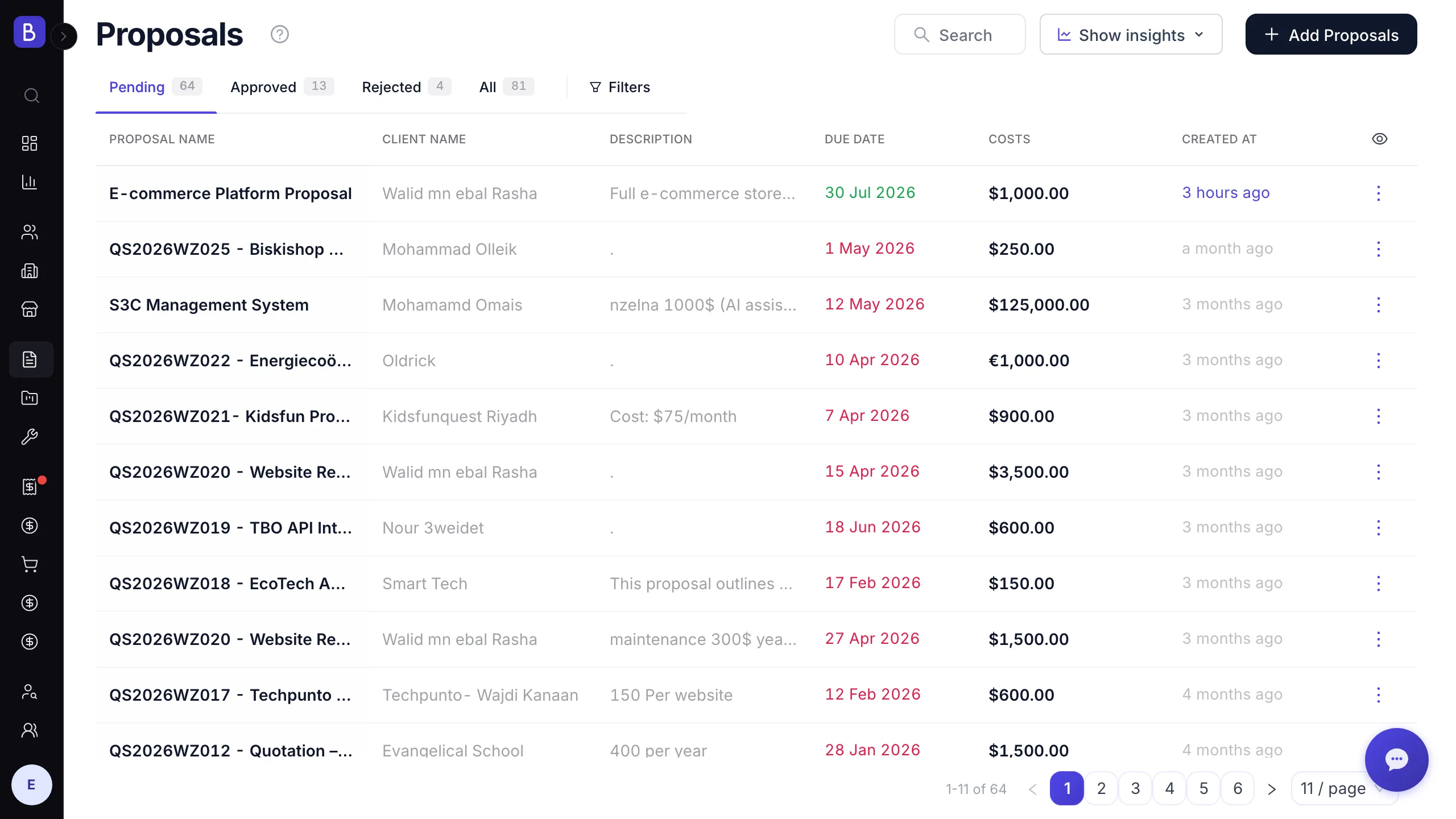
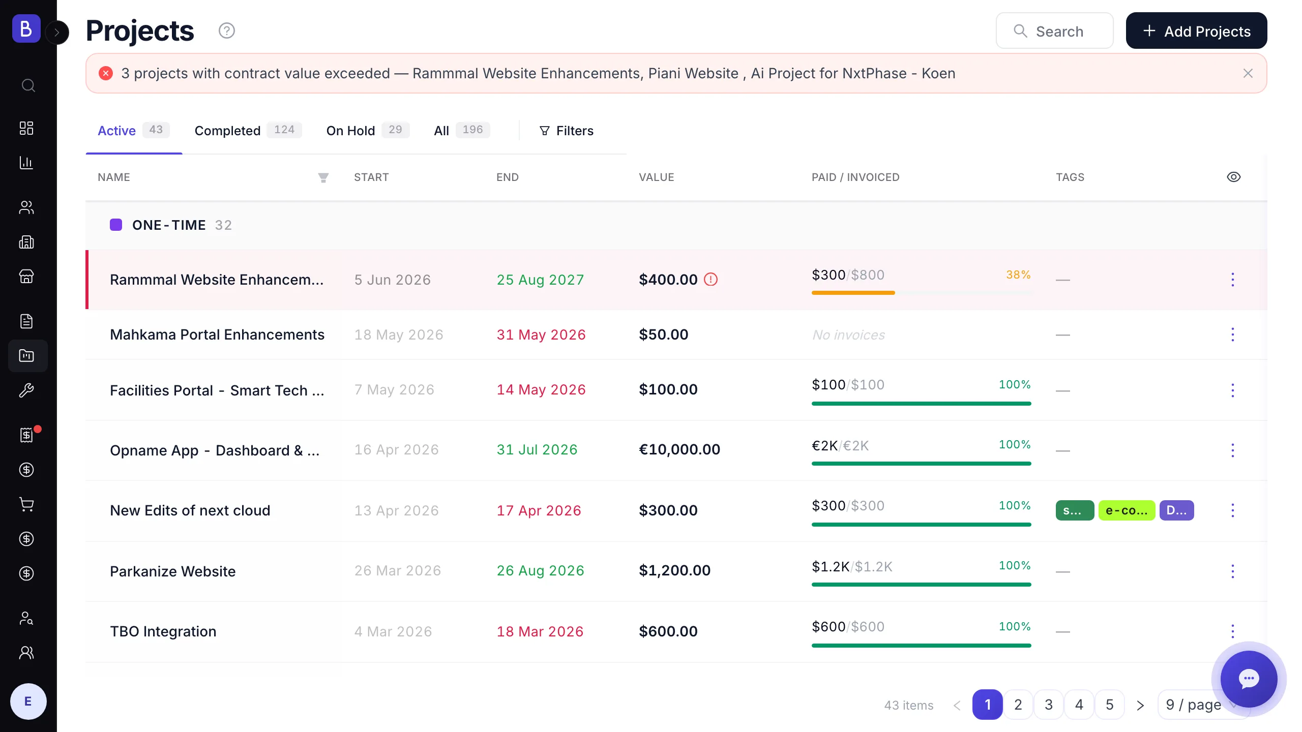
Project margin: which projects make money
Project margin is revenue minus the direct cost to deliver, divided by revenue. Averaged across active projects, it tells you whether the business is actually profitable or just busy. The uncomfortable part is that the average often sits lower than owners expect, because loss-making projects drag down the winners.
Track it monthly and look at the distribution, not only the mean. Aim for gross project margins in the 30% to 50% range for most service work; below 20% is a pricing or scoping problem. The mechanics of computing it, including loaded labor cost, are worth getting right, and the guide on tracking project profitability walks through the formula.
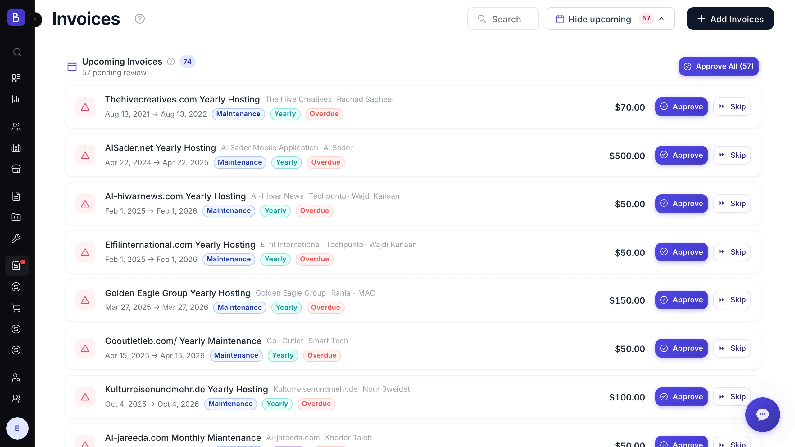
Days sales outstanding: how fast clients pay
Days sales outstanding, or DSO, is the average number of days between sending an invoice and collecting it. You can be profitable on paper and still miss payroll if the cash is stuck in receivables, which is how otherwise healthy firms get into trouble.
Under 30 days is excellent, 30 to 45 is normal, above 60 is a problem, and above 90 means you are financing your clients for free. Track it monthly and watch the trend more than the absolute number. If DSO is creeping up, something specific is wrong: invoices going out late, terms that are too generous, or a few chronically slow clients. Catch it early while it is still a nudge, not a crisis.
Pipeline coverage: is next quarter already at risk
Pipeline coverage is the total value of qualified open opportunities divided by your revenue target for the coming period. It is the one forward-looking number on the list, and it lets you see a slow quarter months before it arrives.
Aim for roughly 3x coverage for the next quarter, because not everything closes. If your target is $200,000 and typical close rates run 25% to 35%, you need something like $600,000 in qualified pipeline to have a fair shot. Below 2x is a warning that you will likely miss unless close rates jump. Far above 5x is not strength; it usually means the pipeline is stuffed with stale opportunities that will never close.
Revenue concentration: how exposed you are to one client
Revenue concentration is the share of your revenue coming from your largest client, or your top few. It is a risk metric, not a performance one. A firm where one client is 45% of revenue is one bad renewal away from a crisis, no matter how good this quarter looks.
There is no universal safe number, but when a single client passes roughly a third of revenue, treat it as a standing risk: protect that relationship deliberately and work to broaden the base. Concentration is easy to ignore while the big account is happy, which is exactly why it belongs on the dashboard.
The vanity metrics you can stop tracking
Some numbers feel like progress and change nothing:
- Social media followers, impressions, and engagement. Unless social is the service you sell, these barely correlate with revenue for a service firm. Track leads generated from social, not the follower count.
- Number of proposals sent. Volume is not the goal. Ten well-qualified proposals at a 40% win rate beats forty scattershot ones at 10%. Track win rate and average deal size instead.
- Raw website traffic. Traffic without conversion context is noise. If you track web numbers, track the conversion funnel.
- Hours worked per person. This is not utilization; it rewards face time over output and encourages padding. Track billable versus available time and project outcomes, not effort.
How to turn six numbers into decisions
A metric earns its place only if a change in it triggers an action. Before adding anything to your dashboard, ask: if this number moved sharply tomorrow, what would we do differently? If the answer is concrete, keep it. If it is vague, cut it.
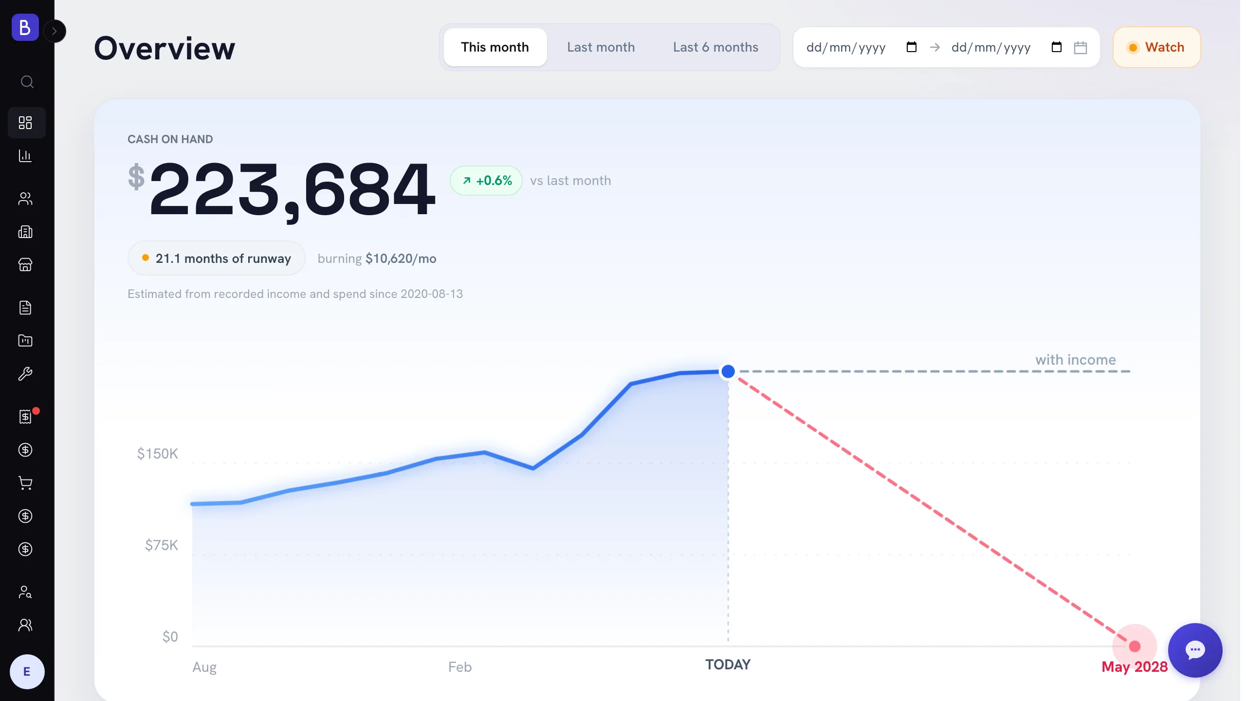
Match cadence to how fast each number moves. Review utilization and DSO weekly, project margin and effective rate monthly, and pipeline coverage and concentration each quarter. Keeping them next to the underlying work helps: an analytics overview that shows cash on hand, money in and money out, runway, outstanding invoices by age, profit and margin, and revenue concentration in one place means each number links straight back to the projects, invoices, and clients behind it. Six numbers that drive decisions beat forty that decorate a screen.